Today we're gonna take a look at one of the ways you can add depth to your pieces, fine tune your work, and hopefully improve your control with the medium of your choice to really get your ideas on paper and feeling realistic!

Many times I see young artists who do very colorful pieces but find that the final product feels flat and don't understand why this is. Well the answer to that is a lack of value. Color can be a very tempting thing because it creates a physical reaction. It jumps off the page and demands our attention. But the key to getting your colors to work for you in a way that doesn't feel flat is to practice the basics. First off a definition:
Value- The lightness or darkness of a color. Think of a black and white photograph, there isn't just white and black but a myriad of grey tones that define the forms and help create space and volume.
Hue- An art term basically referring to color. Every color (red, green, blue, yellow, etc..) can be altered using value. This means you can have a deep velvety burgandy color, a bright barn red, or even soft pink. They're all red but they fall in different places on the value scale.

So, the first step to good value control is to create a scale. Usually this consists of about 10 or more squares that range from black to white. Every drawing class I've ever taken requires you to create one of these and although it can feel like pointless work it helps your brain to subconsciously record the subtle differences between the values and will definitely improve your work with practice.
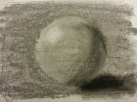
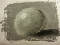
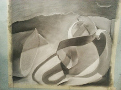
It's good practice to do one of these on your paper somewhere when you're testing out a new medium, new type of paper, or just to keep your skills up. You can also do value studies using simple forms like orbs to help you visualize light and how to build volume with only value. Below is an example I did. This was a quick value study to try out a Gel Medium on sketchbook paper. I coated one square with Golden Gel- Fine Pumice Gel (available at any art supply store) and let dry to create a sheer texture on the paper. The other square I left as just sketchbook paper to see the difference. (It's also a good idea to leave yourself notes as to the materials you used and what the effect was so you can remember the next time you go to buy material).
As you can see the medium allowed me to build up a much thicker layer of the charcoal whereas without it, the paper showed through and the charcoal didn't cling. I was able to get a lot more definition to the form on the medium as well. These aren't great examples of a good range of values because they're quick sketches but, the general idea of using value to create form and volume is there.
A great rule of thumb that one of my art professors told me was that if the value scale you did on the side of your paper is more visually interesting than the drawing, you aren't using enough value. Keep that in mind and do some value charts.
Thanks for reading!
-Christine Lane-
A great rule of thumb that one of my art professors told me was that if the value scale you did on the side of your paper is more visually interesting than the drawing, you aren't using enough value. Keep that in mind and do some value charts.
Thanks for reading!
-Christine Lane-

 RSS Feed
